
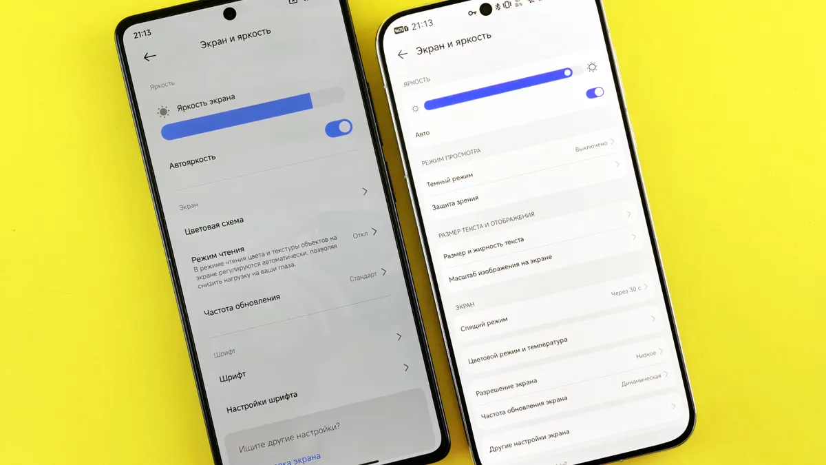
How to Compare Mobile Phone User Interface Features
Last updated: November 18, 2026
Quick answer: compare mobile phone user interface features by checking 5 things — launcher layout, gesture navigation, app drawer, bloatware, and one-handed reach. The mobile phone user interface features in How to Compare Mobile Phone User Interface Features are not just a skin; they decide how fast you get to apps, how much you can change, and how tiring the phone feels after a week.
A writer who follows mobile software and update support can judge the mobile phone user interface features trade-offs by the features vendors expose, the defaults they impose, and the standards they borrow from Android and iOS. See also the mobile software and update support guide and Android vs iOS comparison.
Key takeaways
- Judge the mobile phone user interface features by daily tasks, not by screenshots in a store listing.
- Launcher freedom matters most if you rearrange icons, hide apps, or use custom widgets.
- Gesture navigation can feel faster, but it also punishes sloppy design and cramped hands.
- Bloatware is a real cost because it adds clutter, notifications, and extra steps.
- Pick Android if you want more interface control; pick iOS if you want a more fixed layout and fewer UI decisions.
How do I compare the mobile phone user interface features?
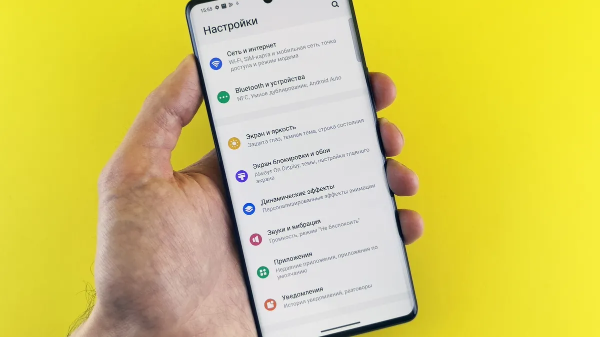
Compare the mobile phone user interface features by running the same five checks on every phone: launcher, gesture navigation, app drawer, bloatware, and one-handed use. That gives you a clean read on how the phone will feel after the first day, not just how it looks in a promo image.
Start with the home screen. On Android, the launcher can change the whole feel of the phone because the launcher controls the home screen grid, icons, widgets, and often the app drawer. On iOS, the home screen is more fixed, which is easier for some people and too rigid for others.
Then check how the phone handles movement. Android gesture navigation and iOS gestures both reduce visible buttons, but the details matter: the back action, the app switcher, and the bottom-edge reach can either feel natural or irritating. For design guidance, Apple’s Human Interface Guidelines and Google’s Android UI guidance both show how much thought goes into touch targets and gesture flow.
What should I look for in a launcher?
Look for a launcher that lets you change the screen without turning the phone into a mess. A good launcher gives you enough control to move icons, add widgets, hide the apps you never touch, and make the main screen work around your habits.
This is where Android usually wins. Android launchers can vary a lot by brand, and that variety is the point: some people want a nearly blank screen, while others want a dense grid, folders, and a separate app drawer. That flexibility is useful if you change phones often or want your phone to mirror how you work.
The trade-off is that more choice brings more clutter. Some Android skins add duplicate apps, duplicate stores, or duplicate settings menus. That can make the launcher feel powerful on day one and busy on day ten. iOS is the opposite: fewer choices, less chaos, and fewer ways to make a bad layout.
How much should gesture navigation matter?
Gesture navigation should matter a lot if you use your phone one-handed or jump between apps all day. It changes the feel of every swipe, tap, and back action, so a bad implementation will annoy you faster than a weak camera app or a dull wallpaper pack.
Android and iOS both rely on gestures now, but they do not behave the same way in every detail. On Android, the back gesture and app switching can vary by brand and version, which means the same motion may feel clean on one phone and awkward on another. On iOS, the gesture set is more consistent, which helps if you want muscle memory that survives upgrades and device changes.
The drawback of gesture navigation is that it can hide what the phone is doing. A person who prefers visible buttons may find gestures slower at first, especially on a large phone. If you often use the phone on a train, while walking, or with one hand, check whether the swipe zones sit where your thumb naturally lands.
The Honest Side-by-Side
The right comparison is not “Android versus iOS” in the abstract; it is which UI fits your habits. Android wins for customization, while iOS wins for consistency and fewer decisions. That split shows up in the details that affect daily use.
| Criteria | Android | iOS | Winner for [condition] |
|---|---|---|---|
| Launcher control | Many brands allow deep launcher changes | Home screen is more fixed | Android for heavy customization |
| App drawer | Often available and useful for large app libraries | No traditional app drawer in the same sense | Android for people with many apps |
| Gesture navigation | Can vary by brand and skin | More consistent across devices | iOS for predictability |
| One-handed use | Depends heavily on size and brand skin | Also depends on size, but controls are often more consistent | iOS for simpler muscle memory |
| Bloatware | Can be a real issue on some models | Usually lighter in feel, though default Apple apps remain | iOS for cleaner defaults |
| Widget control | Often broader and more flexible | Available, but more controlled | Android for layout freedom |
| Default app choices | Usually more open to change | More restricted in practice | Android for power users |
| Learning curve | Can be steeper because skins differ | Easier because the model is familiar | iOS for first-time users |
| UI consistency across brands | Varies a lot | Stronger consistency | iOS for shared workflows |
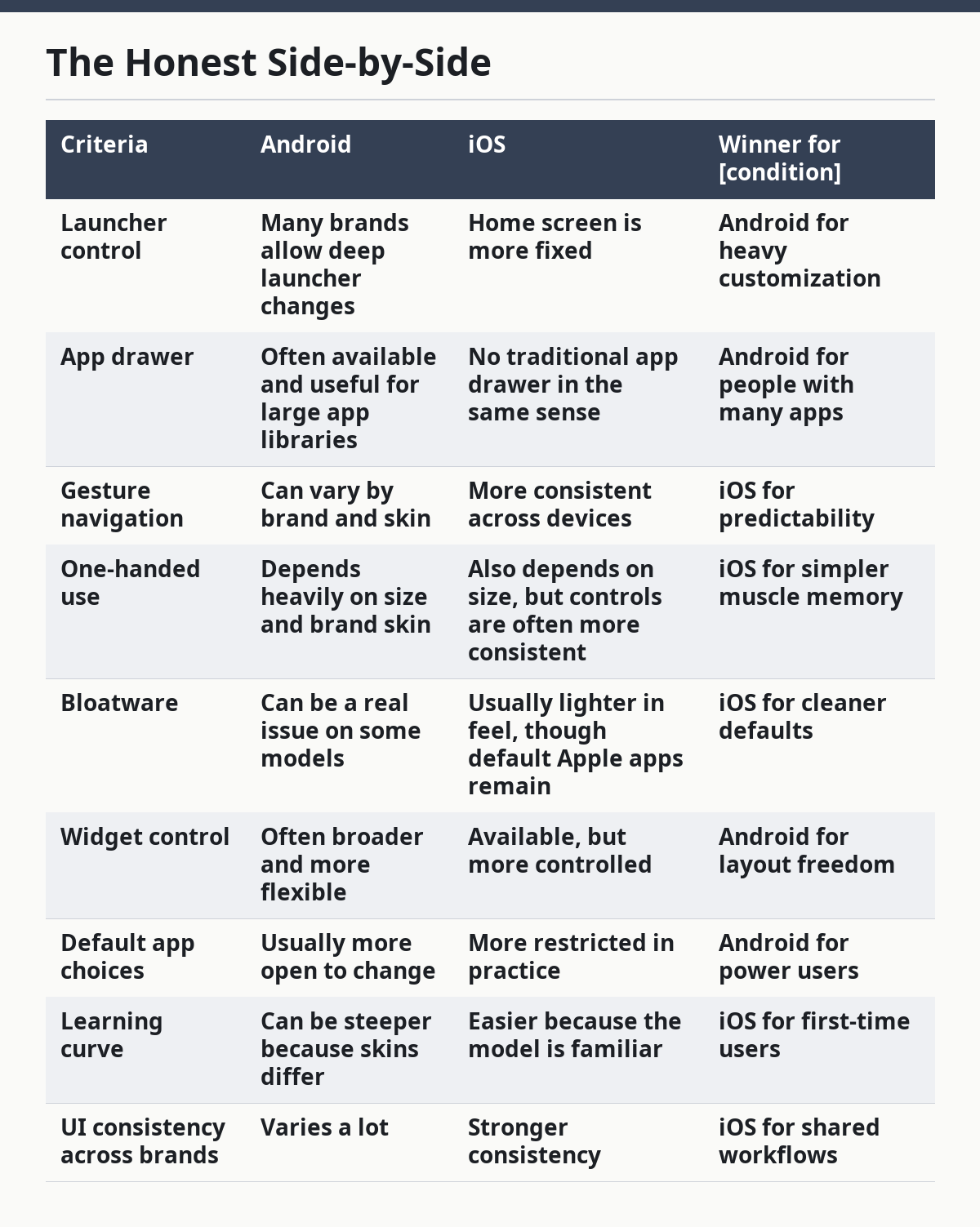
That table hides an important truth: Android is not one interface. A Samsung skin, a Pixel-style build, and a heavy carrier build can feel like different products. iOS is more uniform, so you compare one Apple interface to another with less guesswork.
Which interface fits your daily use?
Android fits best if you want to shape the phone around your habits. If you care about launcher freedom, an app drawer, widget placement, and fewer limits on the home screen, Android gives you more room to work. It is the better choice for someone who likes to organize apps by task, group tools into folders, and change the phone’s look without much friction.
The weakness is that Android can ask you to manage more. Some phones arrive with bloatware, duplicate apps, and settings that differ by maker. That adds friction, especially if your goal is to set up the phone once and leave it alone for 2 or 3 years.
iOS fits best if you want the same path every time you open the phone. If you value consistency, clean defaults, and a shorter learning curve, iOS is the safer pick. It is also the easier choice for a person who does not want to spend a Saturday sorting icons or fixing a launcher that feels too busy.
The weakness is rigidity. If you want to change the home screen logic, hide more of the system’s assumptions, or reshape the interface around a very specific workflow, iOS may feel limiting. Apple’s Human Interface Guidelines reflect that philosophy: fewer surprises, fewer layout experiments, less room for extreme customization.
When do bloatware and app drawer differences matter most?
Bloatware and app drawer differences matter most when the phone will be used as a tool, not a toy. If the device will hold work apps, travel apps, banking apps, and a lot of one-off utilities, then the home screen can become crowded fast. An app drawer helps because it keeps the main screen cleaner while still letting you keep many apps installed.
Android can be better here because the app drawer is familiar and useful. The downside is that some Android phones ship with extra preloaded apps that take up space and add prompts you do not need. That extra software can make setup slower and the interface feel less tidy.
iOS usually feels cleaner at the start, but that does not mean it is perfect. The lack of a traditional app drawer changes how a person organizes apps, and some people dislike that all apps are part of the same home-screen system. If a clean first impression matters more than deep sorting, iOS wins. If long-term organization matters more, Android usually wins.
What should I do before I decide?
Before you decide, compare the phone the way you will use it for the next 6 months. Check whether the launcher supports the grid and widgets you want, whether gesture navigation feels natural with your thumb, whether the app drawer helps or gets in the way, and whether the phone ships with bloatware that you would rather not manage.
Then ask one practical question: does the interface reduce work or create it? A strong UI saves taps, keeps the screen readable, and makes common jobs feel obvious. A weak UI hides basics, adds duplicate steps, and makes simple actions feel heavier than they should.
The mobile phone software and update support hub covers the policy side; this page is about the day-to-day feel of the interface itself. Keep those two questions separate so you do not confuse long-term support with everyday ease of use.
What are the exception scenarios?
The overall verdict flips when your needs are narrow and specific. A person who wants maximum home-screen control should not pick iOS just because it feels polished. A person who wants a familiar layout with fewer decisions should not pick Android just because it offers more settings.
The first flip case is a brand-specific Android skin that feels close to iOS in layout but still allows better app organization. The second is a user who depends on one-handed use on a large device; a cleaner gesture system and simpler controls may matter more than customization. The third is someone who hates clutter and never changes the home screen; that user will notice bloatware more than widgets or launchers. The fourth is a first-time smartphone user who benefits from fewer choices and less setup.
The Verdict: Which one should you choose?
Choose Android if you want launcher control, an app drawer, and more room to shape the interface around your habits. Choose iOS if you want consistent gestures, fewer interface decisions, and a cleaner default feel. Neither if you cannot tolerate either bloatware on Android or the tighter layout rules on iOS.
How do I compare one-handed use on different phones?
Compare one-handed use by looking at reach, not just screen size. A phone can be easy to hold and still be awkward to use if key controls sit too high, the gesture zones feel cramped, or the launcher puts common apps out of thumb range.
This is where interface and shape meet. A good mobile phone user interface keeps the most-used controls near the bottom edge, supports quick access to search, and does not force the thumb into repeated stretches. If a phone needs two hands for basic tasks, the interface is working against the user.
That is also why the same UI can feel better on one model than another. A launcher with a bottom dock and a simple gesture set can help a large phone feel manageable. A crowded home screen with tiny targets can make even a moderate-size device feel clumsy.
What if I am choosing between Android and iOS for the interface alone?
Choose Android if customization is the reason you are buying the phone. Choose iOS if you want the interface to stay familiar with less setup. If the interface is the main reason you are comparing phones, the question is not which one is “better” in general; it is which one gives you the least friction for the way you tap, swipe, and switch apps every day.
That is the cleanest way to compare mobile phone user interface features: launcher first, gestures second, app organization third, and bloatware last. If the phone passes those four checks, the interface will probably stay out of your way.
FAQ
How many mobile phone user interface features should I compare?
Compare 5: launcher layout, gesture navigation, app drawer, bloatware, and one-handed reach. That gives you a quick read without overcomplicating the decision.
Is the app drawer more important than the launcher?
For many people, yes. The launcher shapes the home screen, but the app drawer controls how easily you find apps after you install 20 or 30 of them.
Why does bloatware matter so much?
Because it adds extra apps, extra prompts, and extra steps. On some Android phones, that clutter is noticeable from day one.
Should I trust screenshots when comparing interfaces?
No. Screenshots show layout, not behavior. The real test is whether the phone feels fast, consistent, and easy to reach after a week of use.
Is iOS always simpler than Android?
Usually, yes, but only in the interface sense. iOS is more consistent, while Android can be simpler or more complex depending on the brand skin and launcher.
Drafted with AI; not yet reviewed by a person.